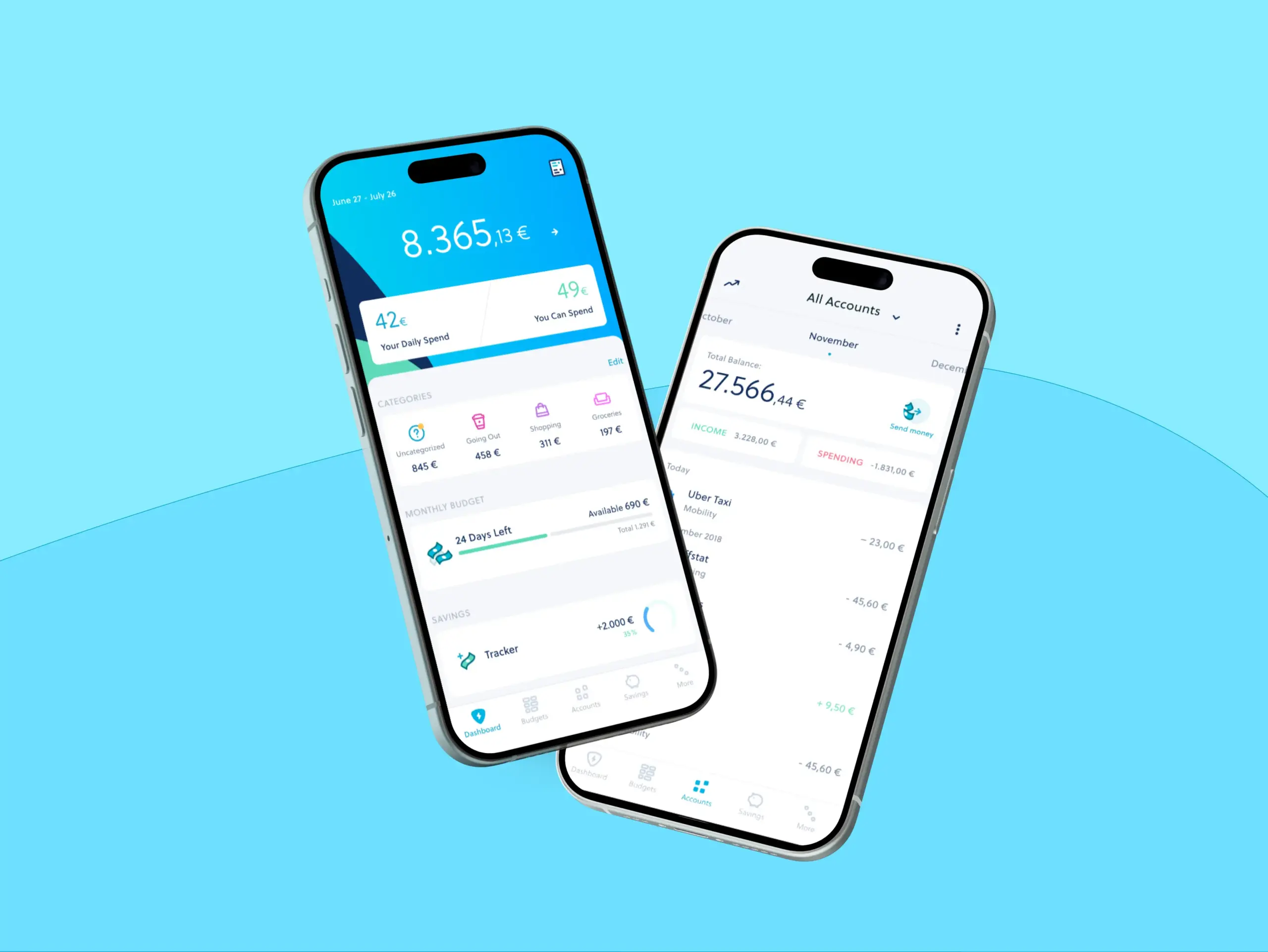
A German fintech app providing users with tools to manage budgets, accounts, and spending from a single mobile dashboard.
Zuper
Brief
Design and iterate on the app’s UX/UI, establishing a branded design system and supporting the rollout of new features across both iOS and Android, as well as related web properties.
Methods
Led the end-to-end UI and UX process, including architecture, branding, and prototyping. Managed a design team, delivered high-fidelity mockups, collaborated closely with developers for implementation, and validated solutions with user research and iterative testing.

Competitive analyses of budgeting apps, fintech, and digital banking platforms were conducted to identify features to adopt, adapt, or discard.
Additionally, heuristic evaluations of our own user flows and UI elements were performed to identify and resolve design flaws in our product offerings.
Each new feature we developed was grounded in initial research conducted with our users and potential customers.
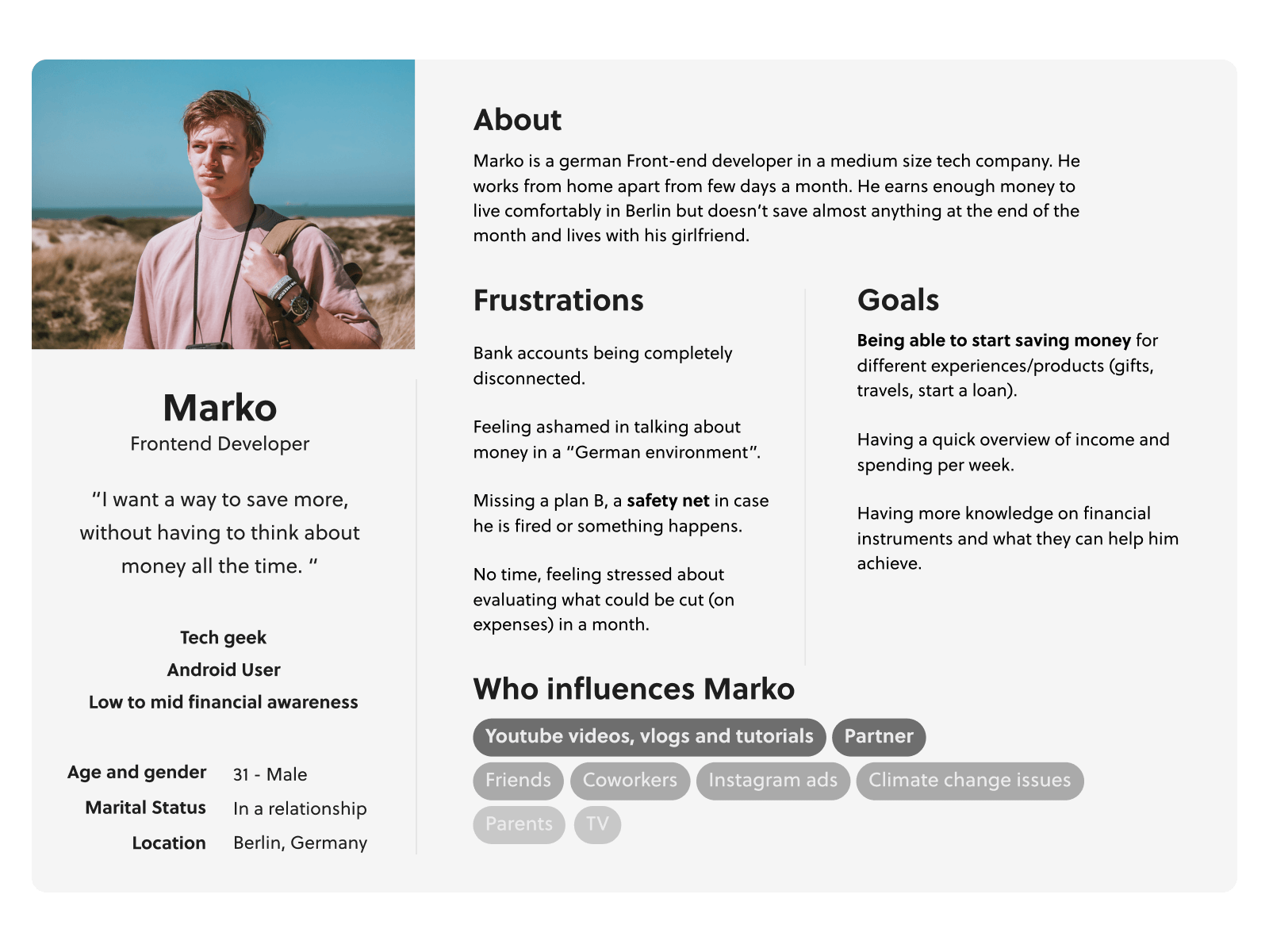
Through user interviews and surveys, we identified primary and secondary design (and later marketing) personas to better understand and address the behaviors and needs of our target users.
The flow of the app were discussed, iterated on and finalized with different stakeholders, mainly our Product Managers and Designers.
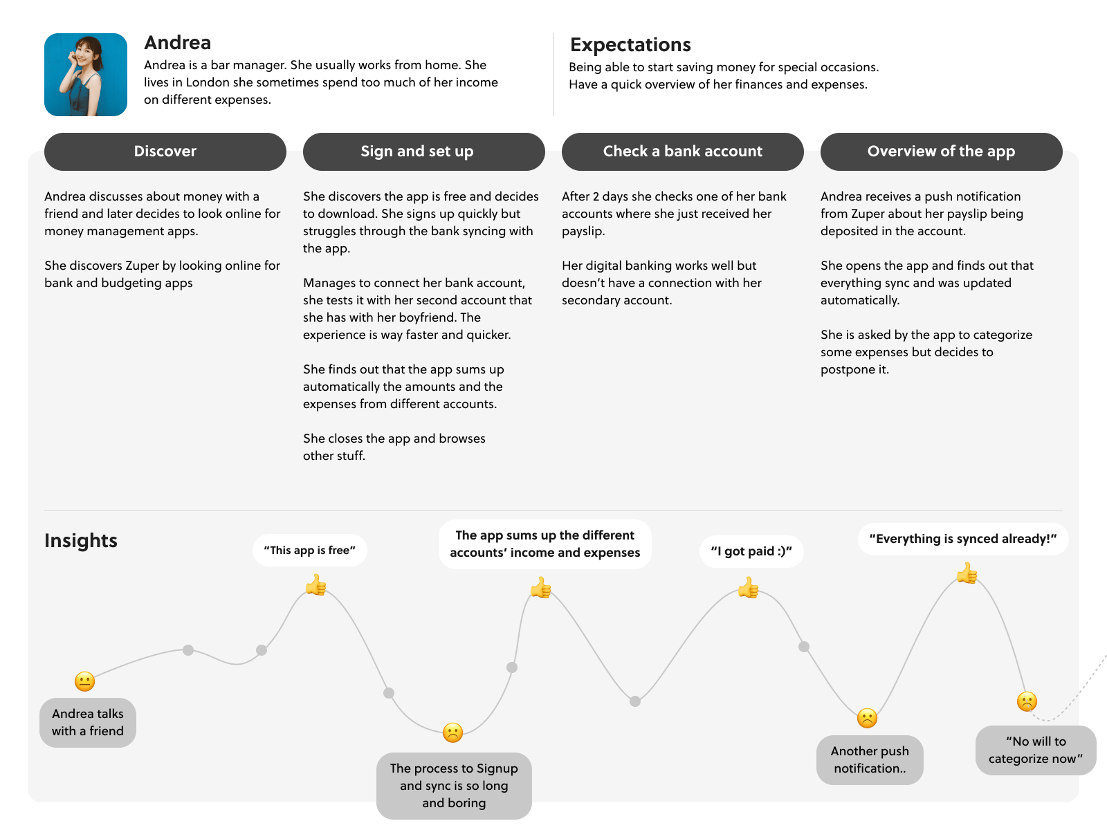
Customer Journey Maps were also made to analyze and read potential edge cases, and specific interactions with our product, from multiple perspectives.
The define and ideate phases were based on problem statements refined through user research and surveys. For each project, we used “How might we” questions to frame core needs and guide ideas.
For example, one key question was: “How might we make it quick and easy for users to navigate their bank accounts?” This sparked quick sketches exploring simpler flows and navigation patterns.
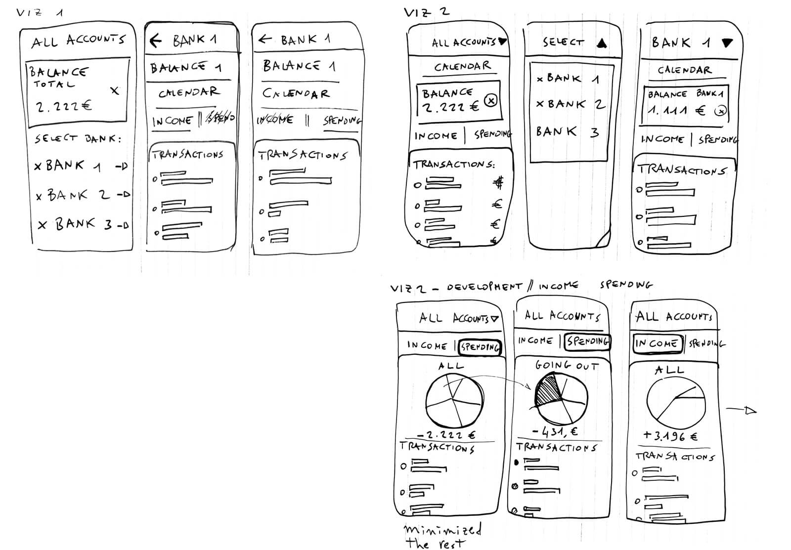
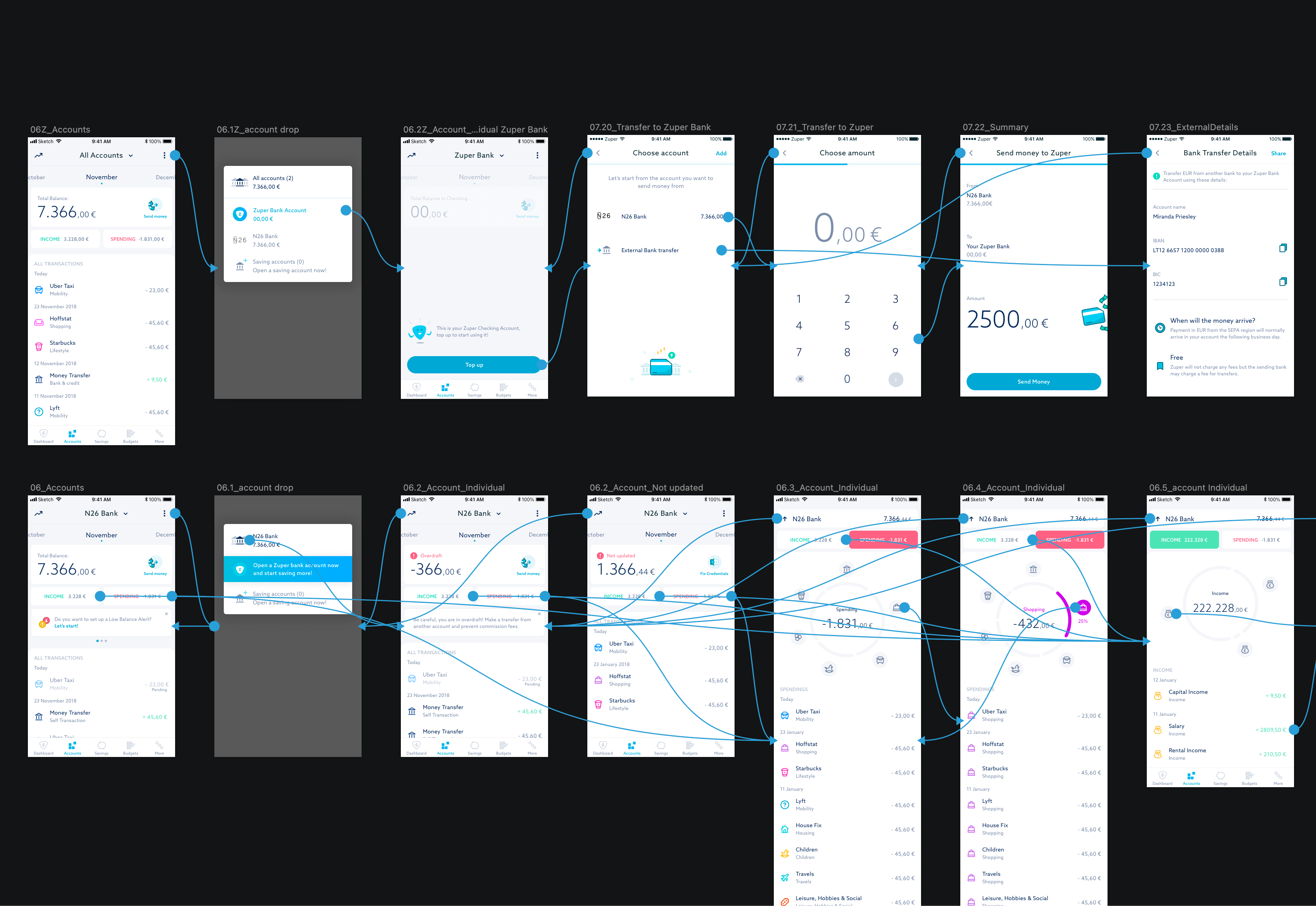
From quick sketches and ideas, we usually passed to digital wireframes that were analyzed and assessed with developers, and finally organized into interactive prototypes.
Those prototypes, when possible, were again tested with customers and iterated on, before the test and production versions of the android and iOS app were released.
Another important element that was developed in a team effort was a Zuper design system.
We started defining a color palette and typography hierarchy. From there we created a structure and ramification of assets, components and patterns for the apps usage.
Finally, we added illustrations based on our iconography and interactive elements.

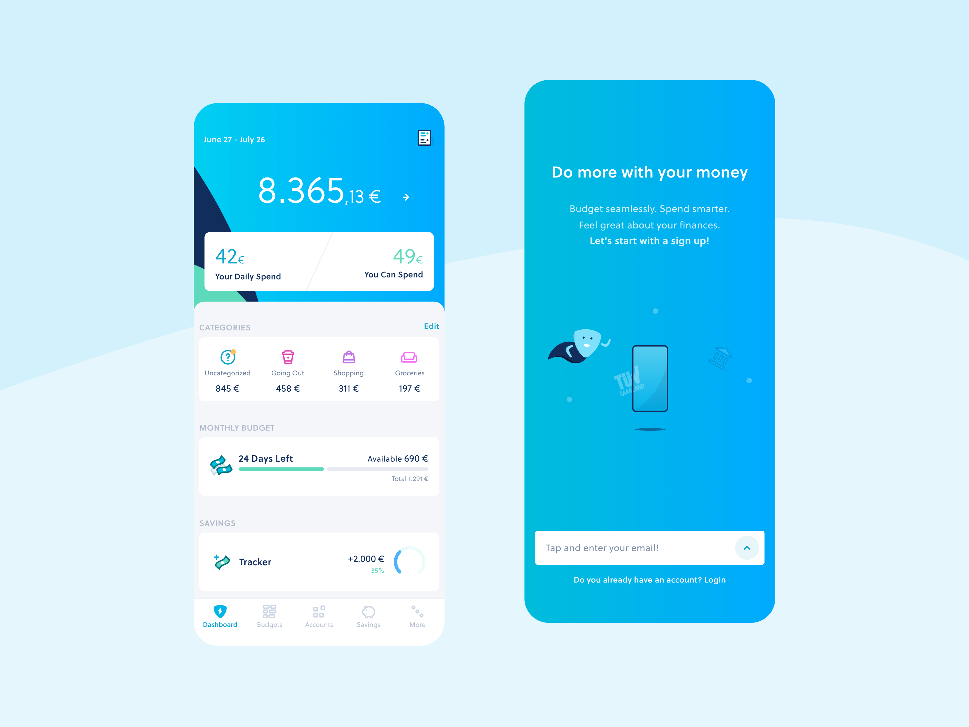
Creating a design system helped us maintain consistency throughout our work.
It ensured uniformity across every step of the app, website, and various project iterations.