Wemby

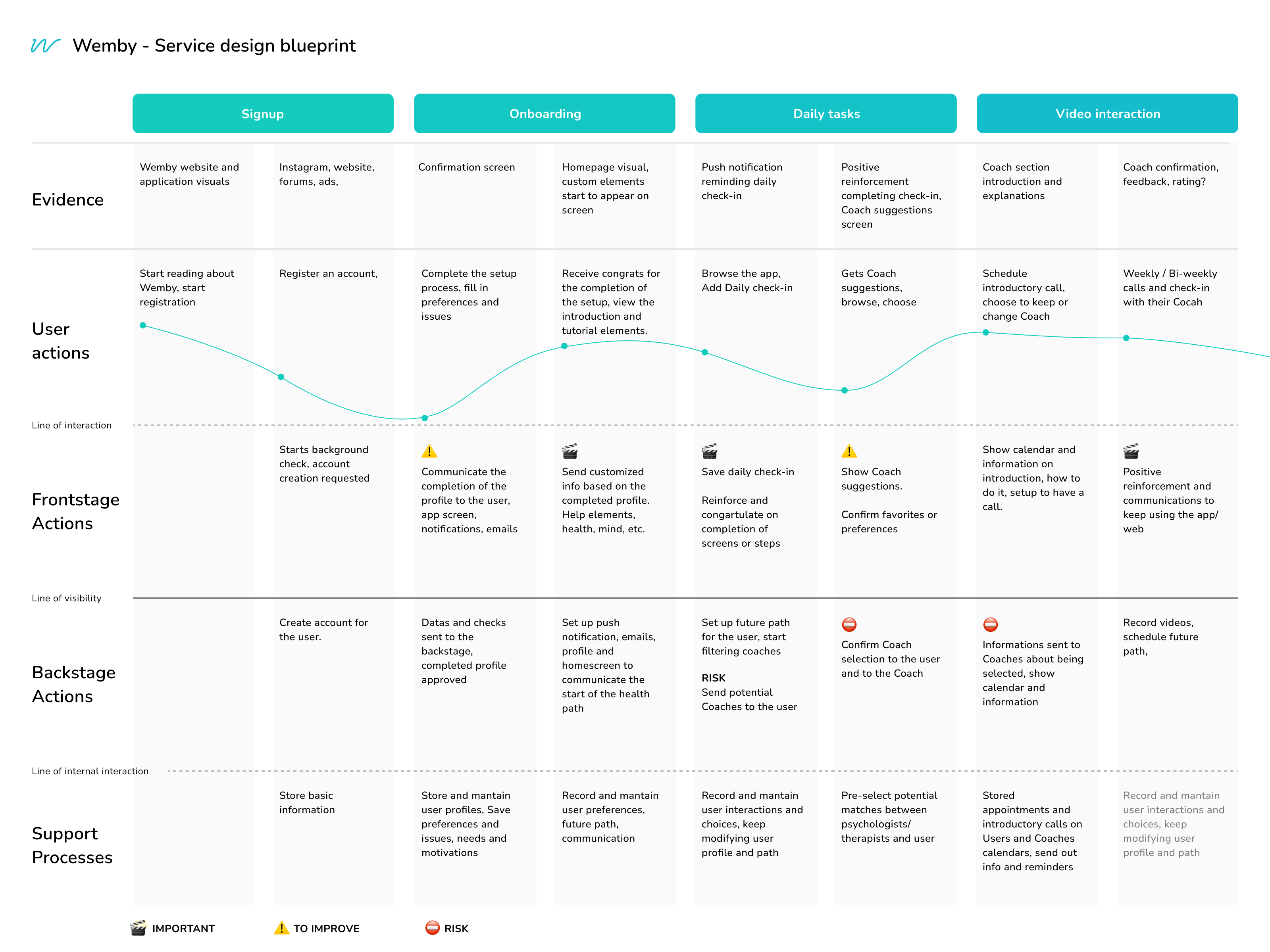
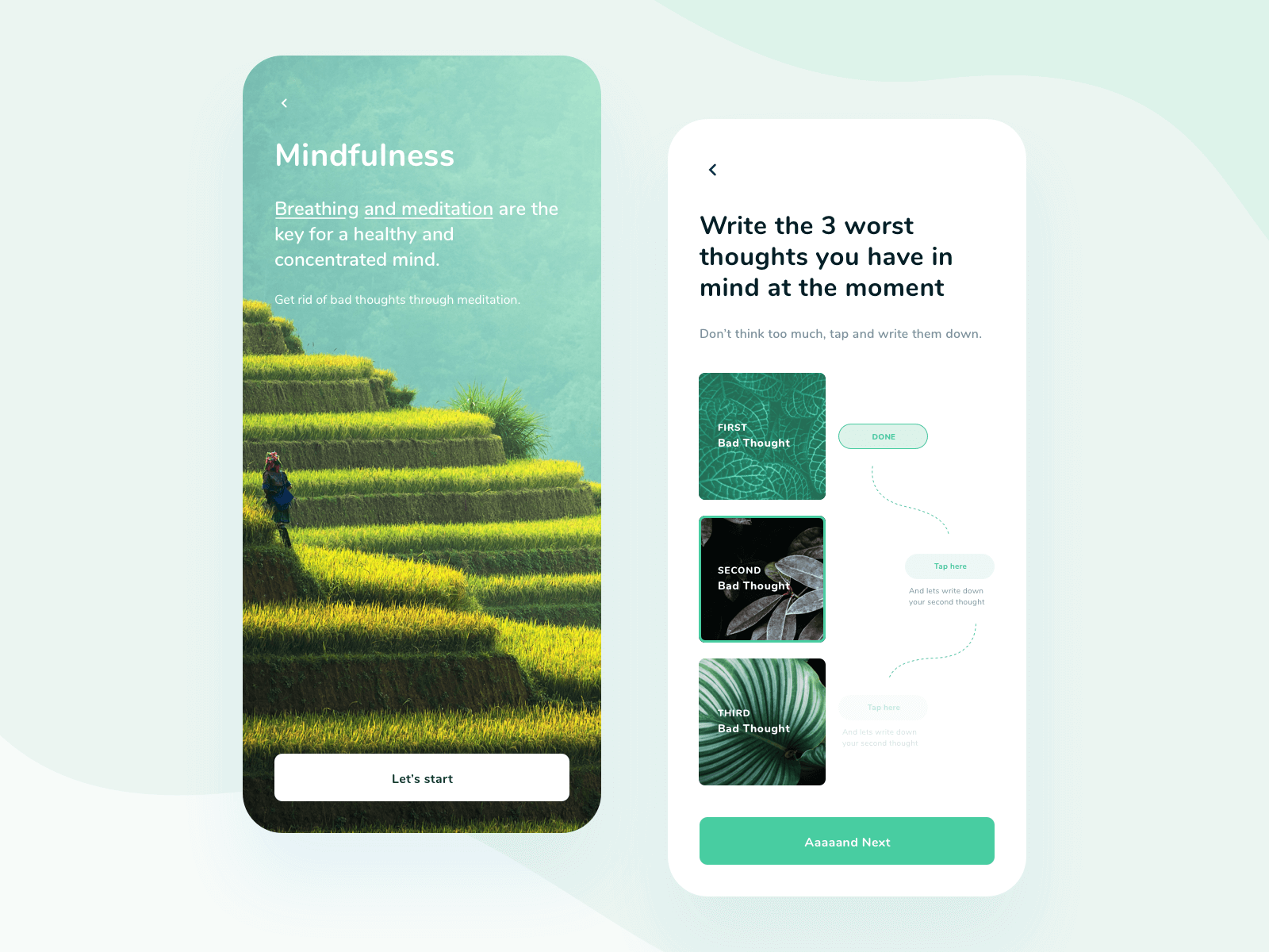
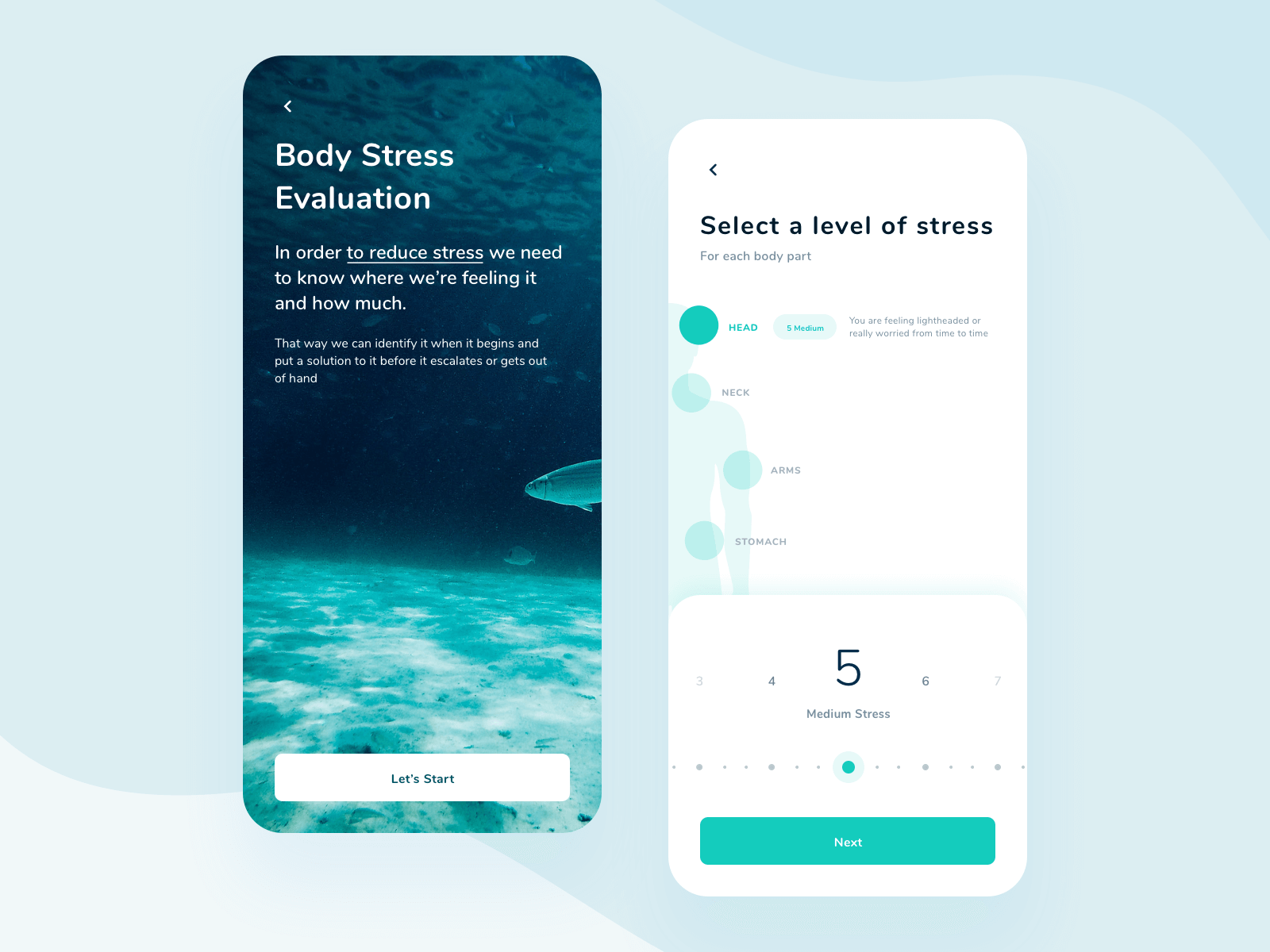
Wemby is an integrated platform where users can find selected wellbeing exercises. It is a B2B platform focused on companies that take care of their employees.

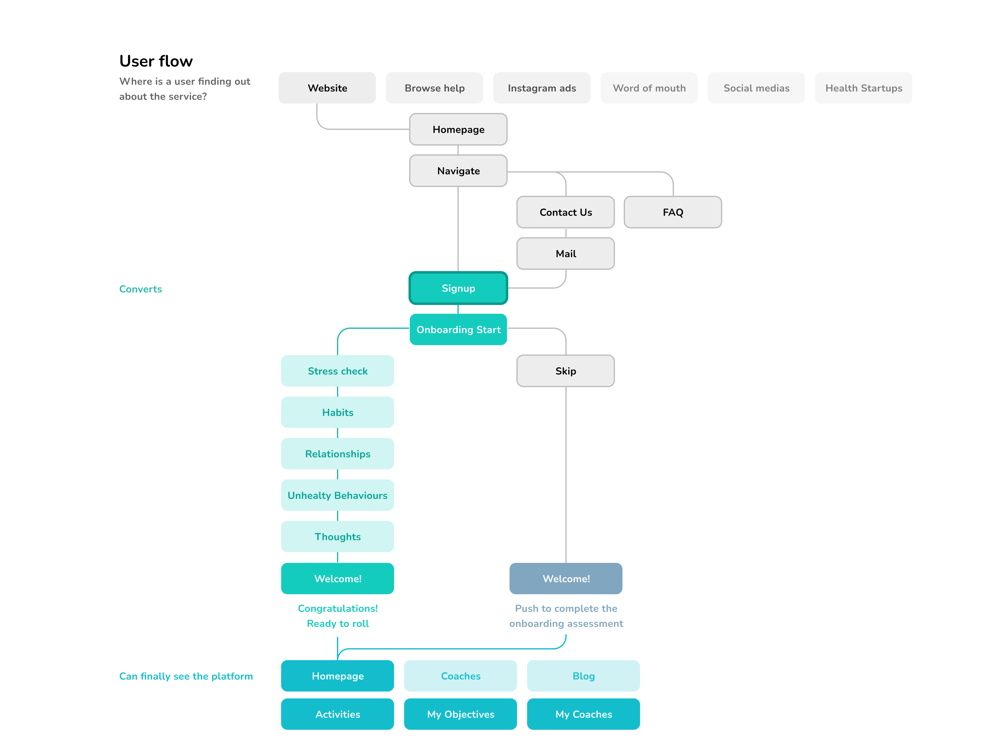
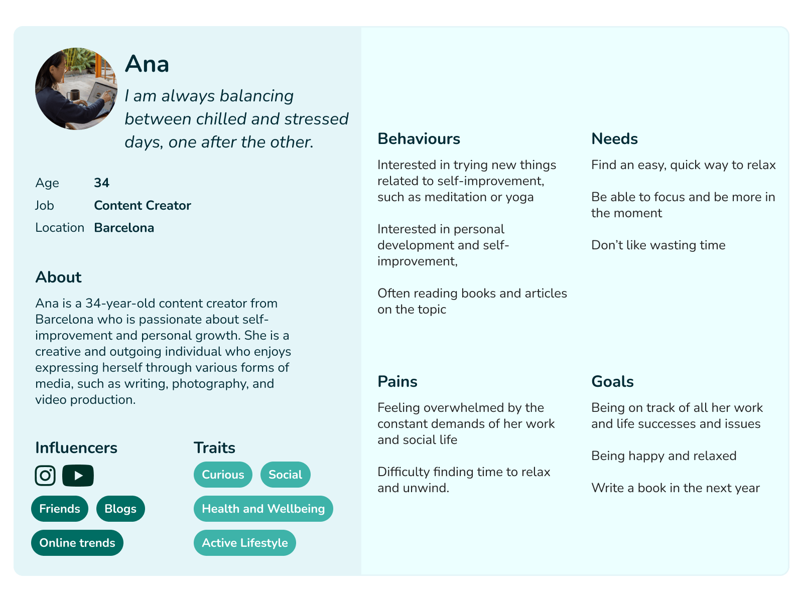
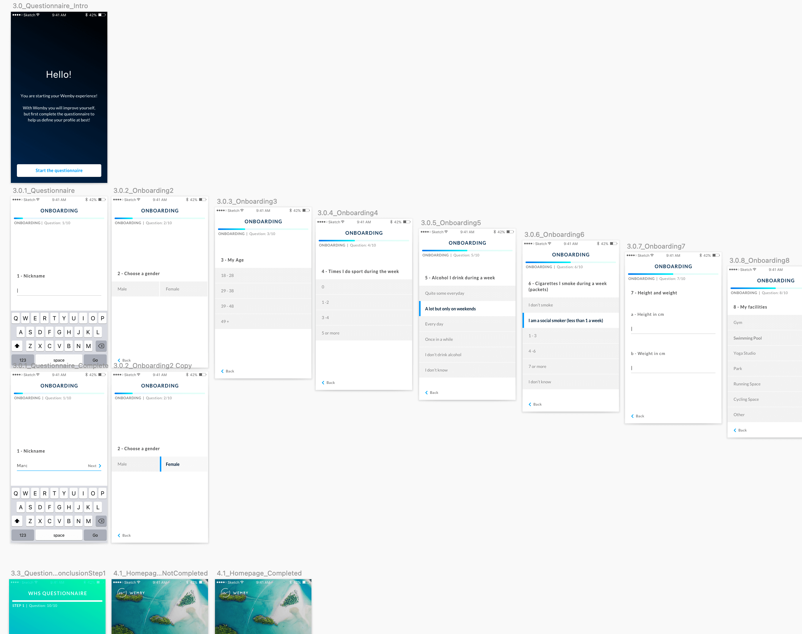
To start the development of the product, our first approach was to run a few quick user interviews and a survey to gather some initial qualitative and quantitative data. From the results gathered from potential users, we created personas and user flows that represented how customers could have interacted with the product.

We used the results of our research to shape a first persona for our product. We based it on the answers from our surveys, plus information and similarities found in our interviews.

From there, we shaped a perspective grid based on the findings of our research, we based it on our potential users and tried to find interesting solutions to the main issues our "test" users were having (when asked about similar products/apps).

The ideas coming out of the research was to base the product on different activities the user was given, the objectives those activities were getting to, and the personal coach that was assigned to them.

Consequently we used the results of our researches to start shaping a Service Design Blueprint of our product, we based it on prototypes and tests we did with our first users to find risks and pain points in our onboarding, setup and initial flows.

The first prototypes of the platform were based both desktop and mobile.
Objectives in particular were a big focus of the product, giving an idea of improvements and developments to the final user.

We separated the main objectives into 2 main areas:
body well-being, ex: Loose weight, Exercise weekly, Grow muscles.
and mind, ex: Meditate, Reduce Stress, Cultivate Relationships.

At the same time we started shaping the image of the product itself through typography and color choices, a logo that represented the nature, human and health, and finally the realization of the commercial website.

After investments and changes in the startup direction, we refocused the collaboration on a smartphone application. This second iteration re-shaped the whole design of the product, starting everything with a mobile approach, and developing each section of the product: onboarding, exercises, daily checks, coaches section. Here an example of high fidelity prototypes for our first iteration of the onboarding flow.

To make all the elements fit in an easy to use and easy to learn product, we made the whole mobile approach comprehensible and able to connect with the final users.

We used big and relaxing images and colors, subtle and short copy and CTAs, with very easy to understand statements and steps.

I spent a lot of time with the user researcher and the psychologist in charge of preparing the different tasks.
This helped me understand how to prepare the UX flows in a simple way, and then how to shape a visual design that could transmit calming emotions and simple concepts.

To do that, we decided to recreate each introductory screen with a full-screen impactful image, and only then showing the real task.